Posts

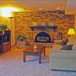
Family Room

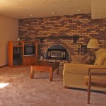
The furniture arrangement in this lower level family room gave the room a lop-sided appearance. Centering the entertainment center on the wall opposite the couch helps balance the room and make it feel less crowded. Gold-framed mirrors and silk greenery draw attention to the fireplace. A floor lamp was added to brighten up a dark corner and existing lighting turned on to provide a cheerful glow. 

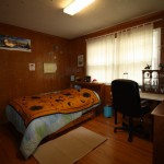
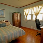
Children’s Bedrooms

The wood paneled walls in this boy’s bedroom gave the room a dark and dated feel, so we removed all the personal wall art and painted the walls a pale shade of blue. A coordinating art print was brought in from another room in the house and placed over the bed. The rug and a small section of the desk were removed and the remaining furniture rearranged to make the room feel more spacious. Greenery on top of the dresser adds a finishing touch.

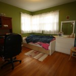
Children’s Bedrooms

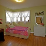
The shocking green made too much of a statement in this girl’s room, so the color was toned down to a soft green. Removing the rug and extra pieces in the corner and makes it feel less cluttered more inviting. A few cheerful floral arrangements were added to complete the transformation. 


Kitchen Nook – Before / After

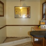
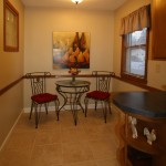
This kitchen nook was transformed into a cozy seating area with a warm paint color, a new light fixture, window valance, furnishings and artwork. After the baseboard trim was finished off, a portable dishwasher was moved to allow space for seating. Accessories were place on the built-in shelves to draw attention to that unique feature.

Living Room Before / After

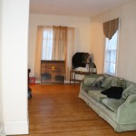
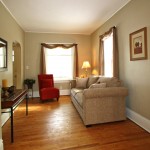
The long, narrow living room in this South Minneapolis bungalow was divided to create separate living and dining areas, making the space more functional. Updated furnishings, artwork and accessories appeal to more potential buyers. Mis-matched window coverings were replaced with matching scarves to frame and highlight the large  windows. A fresh coat of neutral-colored paint helped to hide dingy walls and brought out the architectural details in the woodwork. 


HOMEOWNER TESTIMONIAL:


“Debra gave us great quality at a reasonable price. She made our hum-drum, small house look modern and desirable. Everyone who came through said how great it looked, whether they were interested in buying the home or not.

Debra’s eye for style and hard work helped us to secure two offers in only 4 days on the market – even during these tough economic times. I would recommend Amazing Spaces to anyone interested in making their home outshine the rest.”


Roberta G.


Dining Room

DINING ROOM - BEFORE

DINING ROOM - BEFORE

BEFORE: This dining room appears small and despite the vaulted ceilings. The furniture and light fixture give it a dated appearance.

DINING ROOM - AFTER
DINING ROOM – AFTER

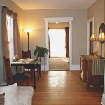
AFTER: Removing a leaf from the dining room table adds needed space to the room. A large art print on the wall takes attention away from the outdated light fixture and adds a touch of color bringing out the warm tones in the woodwork. A solid wood dining table is universally flattering to any decor. A green fern placed in the corner of the adjacent kitchen draws your eye into that space and highlights the unique opening connecting the two rooms.

Master Bedroom

MASTER BEDROOM - BEFORE

MASTER BEDROOM - BEFORE


BEFORE:  While the colors are neutral and there’s certainly no clutter, this bedroom looks more like a dorm room than a master bedroom. The only thing you really notice upon entering the room is the bed… not exactly a unique selling feature!  


MASTER BEDROOM - AFTER
MASTER BEDROOM – AFTER

AFTER:  Centering the bed on the wall and adding a bedside table makes the space appear larger and more functional. Coordinating lamps add much-needed light, and the bed has been made more inviting with the addition of some pillows and a bedskirt. A soft white blanket breaks up the expanse of brown in the bedspread. Artwork on the far wall gives the room depth. A simple scarf window dressing and coordinating pillows help draw attention to the window seat which doubles as a storage bench.


Living Room Before / After

Please click any photo to view it Full Size


Living Room Before

Living Room Before


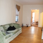
BEFORE:  Special features in this living room like the fireplace, bay window and French doors are difficult to distinguish at first glance. The bright green wall color is too taste-specific for most potential home buyers, and the furniture arrangement makes it difficult to navigate through the space. 


LIVING ROOM - AFTER
LIVING ROOM – AFTER

AFTER:  Changing the wall color to a lighter shade instantly makes the space feel more spacious and open. Swapping the large table at the entry point for a smaller one provides a view to the fireplace and clears the path into the room. The dark area rug was removed to further lighten up the space and show off gleaming hardwood floors. The sofa was repositioned to draw attention to the bay window, and the oversized coffee table was replaced with a smaller one. A few simple accessories add the finishing touch.


Living / Dining Room Makeover

Please click any photo to view it Full Size

Living / Dining Room Before Makeover

Living / Dining Room Before

BEFORE: Despite the white walls, this combination living and dining room seems dark and has no flow through the space. Country-style furnishings make it feel old and outdated, and the view is blocked by curtains. Many people are dissatisfied with the appearance of their homes’ interiors so, if you feel this way too, you’re not alone – besides, there’s plenty that can be done to improve things, especially if you already have some ideas to direct how you want things to look. If you don’t, you can find plenty of inspiration on sites like Collov to get you started with making plans for your home.

Living / Dining Room After Redesign
Living / Dining Room After

AFTER: Painting the walls a rich gold tone brings much-needed warmth to the space. The dark trim was painted white to create contrast, highlighting the dark wood floors. Side-panel drapes frame the windows and the view, allowing plenty of light into the room. A lighter, neutral-colored rug helps to define the conversation area, and updated furnishings are positioned to allow traffic to flow from one space to the other.

Honestly, I am so happy with how this dining room makeover turned out. In my opinion though, I think the lighting is probably the most noticeable change. Whereas before the space looked tired and unwelcoming, the new light that has been installed has made a big change. Ultimately, this just goes to show how important choosing the best possible lighting for your home can be.

That being said, it is undeniable that there are so many amazing lighting options out there nowadays that making the right choice can seem like a daunting task. Nonetheless, if you are thinking about upgrading the lighting in your home, reaching out to an electrician can help you to determine the best possible lighting choices for your space. Accordingly, if you are looking for more information about the advantages of reaching out to an electrician to take care of installing the lighting in your home, you can get it from here.

So, what is your favorite part of this dining room remodel? Get in touch and let me know your thoughts.