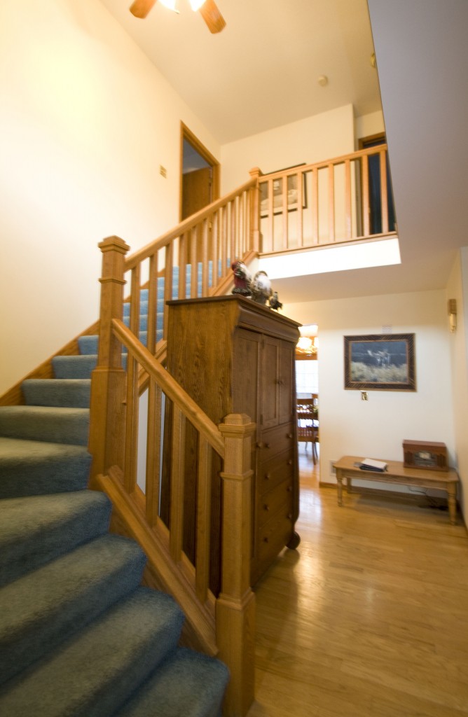
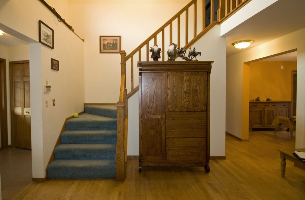
Big, bulky furniture in the entry foyer creates a distraction from what should be an open, inviting space. Also, the dated blue carpet and western-themed art is not going to appeal to the majority of potential home buyers. The coffee table in the corner is awkward and needs to go. An attractive floor vase with tall stems and coordinating wall art are a much better choice.
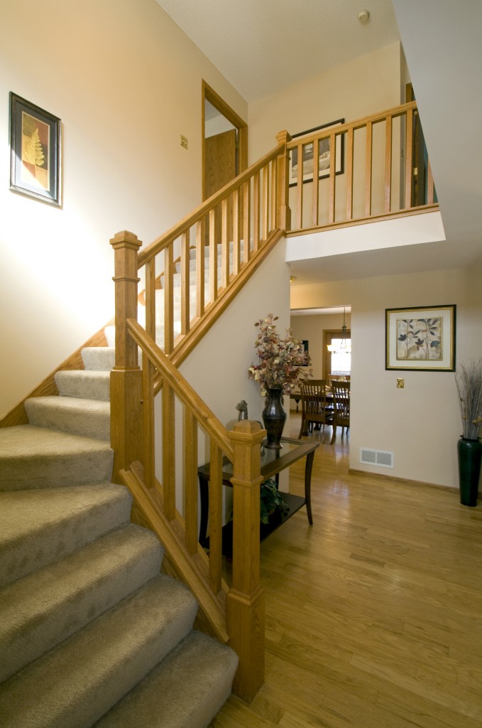
Entry Foyer – View 1
BEFORE
Entry Foyer – View 1
AFTER
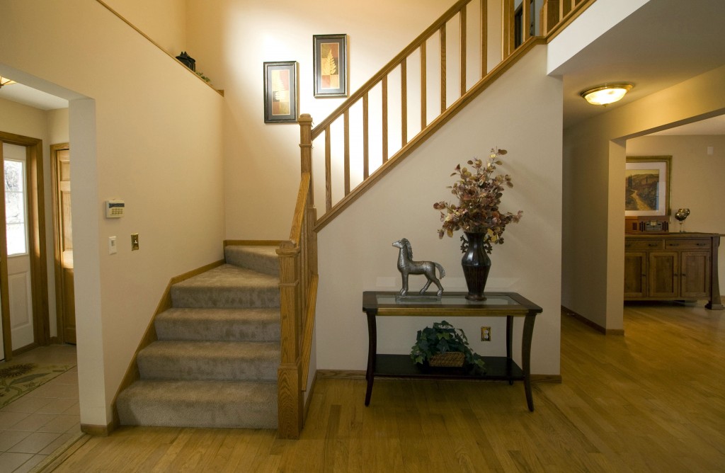
Replacing the over-sized armoire with a console table not only makes the staircase stand out as the selling feature but allows us to add decorative accessories like trunk furniture that add a touch of elegance. Neutral carpet and well-placed artwork offer universal appeal. This foyer is now a grand entry that’s sure to welcome visitors!
Entry Foyer – View 2
BEFORE
Entry Foyer – View 2
AFTER
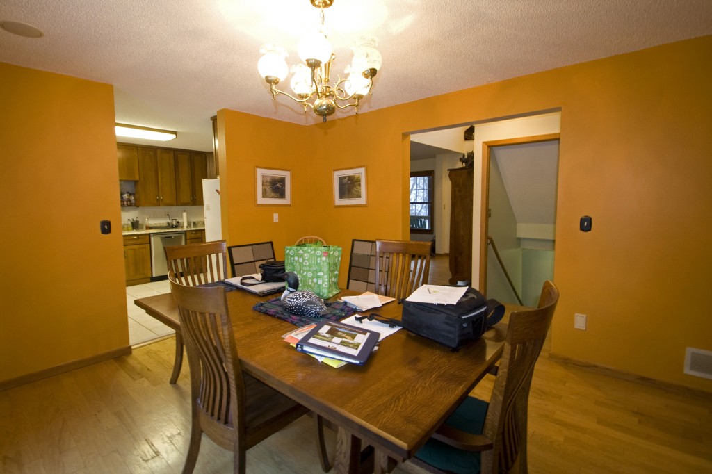
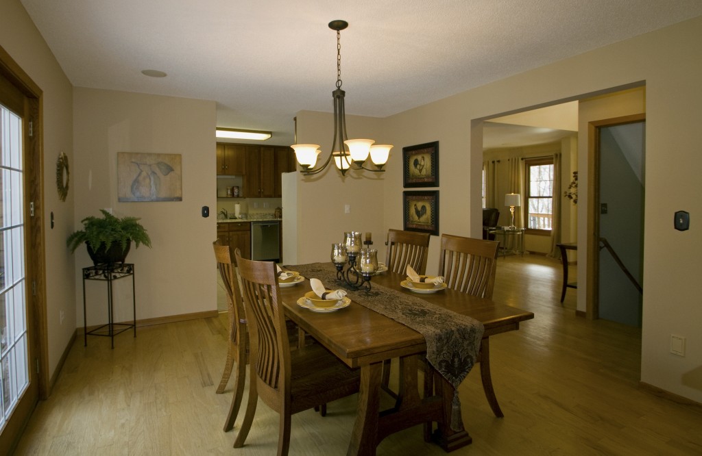
The orange walls in this “before” dining room picture definitely make a statement, but unfortunately, not one that will appeal to a lot of buyers. A light, neutral paint color makes the room feel larger and creates a sense of unity with other rooms in the house. The brass chandelier was replaced with an oil-rubbed bronze fixture for a more updated look. I think if we’d looked around a bit more, we’d probably have gone for something like a custom chandelier as you can get some really modern and striking designs nowadays. The large table was more of a dumping ground than a place to enjoy a meal, so we cleared off the clutter and set an inviting table. Moving the chairs opens things up for better traffic flow. Placing artwork and a fern plant in the corners of the room is another way to increase the perceived size of the space by drawing your eye around the room instead of just focusing on the center.
Dining Room – BEFORE
Dining Room – AFTER
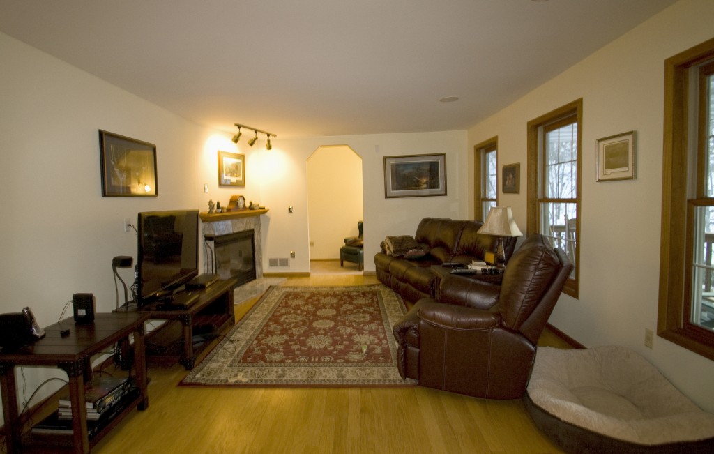
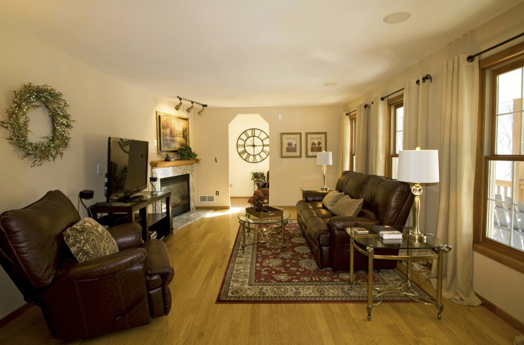
This living room has a very masculine look with the dark furniture and hunting scene wall art. To soften things up, we added window panels to frame each of the windows and added glass-top tables with lamps to add light. The rug was shifted under the sofa and a smaller TV stand replaced the large table to open up some floor space and make it feel less cramped. Moving the large chair to the opposite wall creates better balance in the room. Moreover, to finish off the living room we purchased some luxury homeware from Finlows. Artwork and accessories help put more of a focus on the fireplace, and a strategically placed wall clock in the reading nook at the far end extends the space.
Living Room – BEFORE
Living Room – AFTER
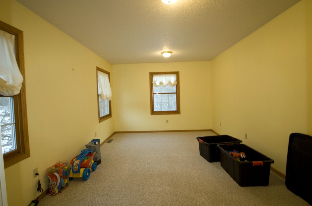
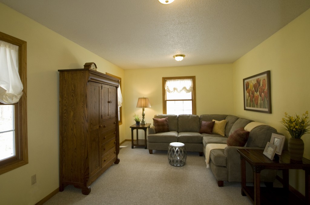
An empty room raises questions in the buyer’s mind as to how it might be used and whether their furniture will fit. Staging this as a family room not only gives it function, but it is much more inviting so the buyer can imagine themselves relaxing in the space. Recognize that armoire? It was originally in the entry foyer, but it makes much more sense here. Whilst you want to give the purchaser chance to imagine putting their own spin on the home, it can go a long way to use tools to make it seem more family friendly, for example you can Print Picture Tiles of family photos to give that welcoming sense that you get when somebody steps into a family home.
Family Room – BEFORE
Family Room – AFTER
