Posts

Family Room Staged To Sell

BEFORE

AFTER

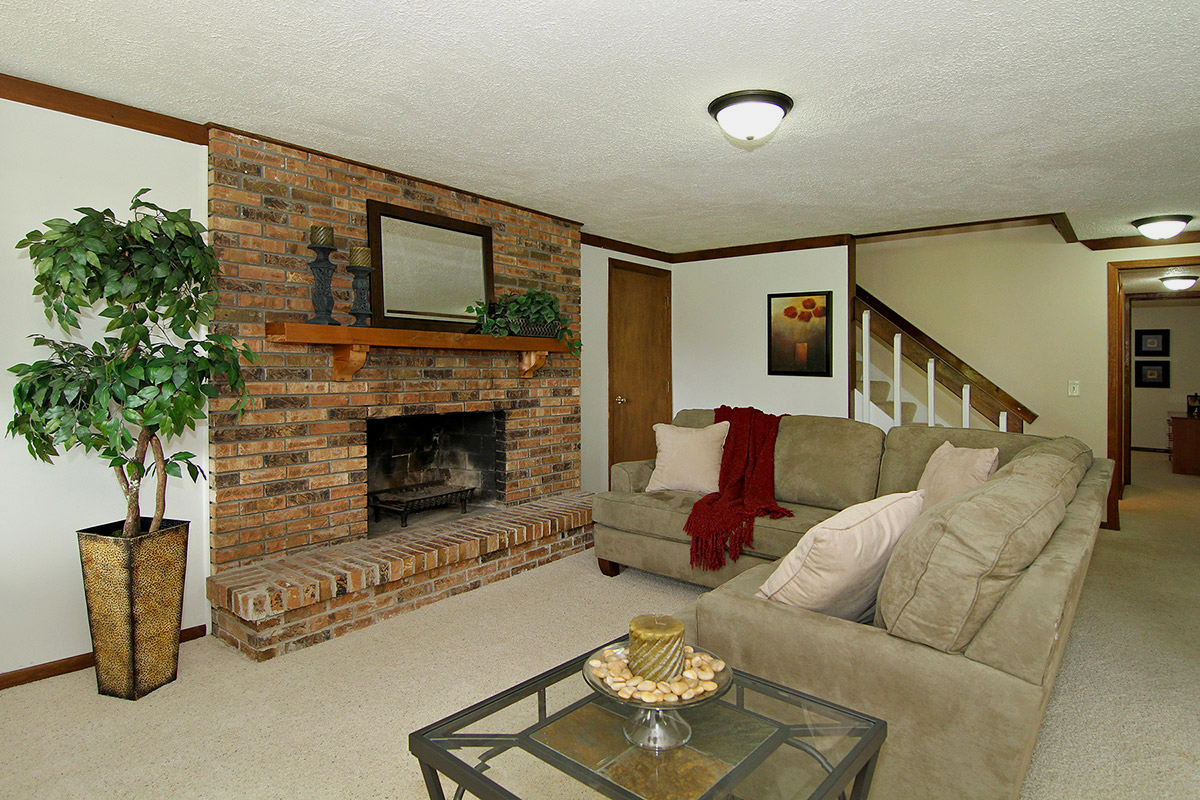
The lower level family room in this home lacked purpose and was more of a pass-through area than a functional space.  After the pile of toys were stored in a closet and the iron & ironing board moved into the laundry room, the fireplace is defined as the focal point by positioning a sectional sofa around it.  A silk tree adds balance and frames the left side, while a large mirror and simple accessories give the mantel some pop.  To give the space a cozy feel, we added a soft blanket and several throw pillows.  Wall art helps to coordinate the overall color scheme.

Kitchen & Dining Room

BEFORE


AFTER


Adjacent to the great room in the previous post is this open concept kitchen and dining area.  The same cream colored paint over the wood paneling makes this side of the room feel updated and spacious and shows off the gorgeous vaulted and beamed ceilings.  Additional updates included new granite counter tops and light fixtures.  Counter tops have been cleared of clutter to give a cleaner, more spacious appearance.  The wood cabinets were cleaned and polished, and the back plates were removed to give the cabinet hardware a fresh look.  Moving the table perpendicular to the wall opens up the traffic flow and adds to the feeling of spaciousness.  Silk greenery above the island cabinet helps to highlight that unique feature and draw the eye upward to the gorgeous vaulted and beamed wood ceiling.

Great Room Makeover

BEFORE


AFTER


The key selling features of this great room are a fireplace, vaulted & beamed ceilings and a large window.  The dark wood paneling not only created a dated look, but it camouflaged those key selling features.  Painting the paneling a soft cream color made all the difference and really helped make the room’s best features stand out.  Updated furnishings, artwork and accessories are arranged to showcase the fireplace and give the space a comfortable ambience.


This home sold in less than one week after being staged!

Great Room Staged To Sell

BEFORE

AFTER

Vacant homes can be some of the most difficult to sell, even in popular areas like los angeles real estate can be tough when the home is bare. How is it possible that empty homes, even in prime locations and close to amenities slip under the radar and remain listed for longer than furnished ones?

There are a few reasons, one is that not everyone has furniture or can move furniture they have when buying a home. In that regard buying a home that is furnished is a lot more desirable than one that is not. But aside from lacking a warm, inviting atmosphere, many potential home buyers find it hard to imagine themselves in empty space.

This particular home, located in an upscale neighborhood, sat on the market for over a year when vacant, but sold in 36 days after being staged. In the before photo you can see there is storage options and a fireplace, but ultimately the room is barren and has little purpose. In the after photograph the difference is clear, it’s an amazing living room. The plants the books and the baubles all help to create the illusion that this room is lived in and used.

All in all, staging rooms is an art for a reason. People are unfortunately not very good at imagining what they don’t have, especially if they don’t own much furniture. Give them a blank space and they’ll be thinking more along the lines of “what should I put in here” rather than “I can put myself here”. The two sound similar, but there is a key difference.

Basement Office

BEFORE

AFTER

When selling a home, it’s important to show function in every area.  In this instance, an empty basement corner was converted into office space simply by adding a desk and chair, silk plants and a few accessories.

Master Bedroom – Before & After Staging

BEFORE

AFTER

In staging this spacious master bedroom, we added a bed skirt and some pillows to dress up the bed, along with a nightstand with a lamp to add light and functionality.  The desk was accessorized and positioned to face into the room.  Extra items like the TV and luggage were put out of sight to make this space an inviting and relaxing retreat.

Bedroom – Staged To Sell

BEFORE

AFTER

Little was needed to take this guest bedroom from “so-so” to “wow!”  We started with a smaller bed to make the room feel less crowded, and dressed it with simple bed linens to complement the lavender walls.  The dresser drawer was replaced, and accessories placed on top inviting those who enter this room to RELAX.

Bathroom Makeover

BEFORE

AFTER

Nothing about this bathroom was very appealing. Even the fittings and fixtures were worn out. The toilet got clogged regularly and sometimes we could see water leaking from it. For that however, we were suggested to search for firms like T.E. Spall & Son (https://thecomfortdoctors.com/plumbing-services-in-dunmore/) who are known to provide good quality plumbing services. We also wanted to check whether the installed water heater was functioning properly or not. After we checked that, we found it in an extremely poor condition and so planned to replace it. A few simple changes were also made. We started by placing new light bulbs in the vanity. The frosted type reduces glare and provides a nice soft light. And trust me, they look amazing! Chocolate brown bath towels and rugs complement the pale blue walls, along with an art print to pull the colors together. So, we decided to change the bath towels and buy new ones. As you can tell, a lot of different changes were made along the way so we started to look into skip bins for hire sydney way to clear the unwanted contents of the bathrooms that we got rid of in the process. A spare roll of TP was put away inside the cabinet, and fresh flowers and an updated soap dish completed the makeover. We are actually happy about this renovation. The bathroom does not look shabby anymore and smells fresh every time we enter. If you too have a bathroom that requires an urgent makeover, do not think twice. A clean and tidy bathroom is necessary for maintaining good health. On the other hand, unclean bathroom could invite diseases like urinary tract infection and Hepatitis!

Living and Dining Room – Before & After Home Staging

BEFORE

AFTER

The goal with this combination living and dining room is to make the areas feel more spacious and improve the flow from room to room. By removing the entertainment stand and positioning the shelf unit underneath the wall-mounted TV, the space already seems bigger. Accessories were kept to a minimum, and the drapery panels were re-hemmed to reach the floor.

This room was not expensive to redecorate either. A lot of the new furniture was purchased at a bargain price from the Home Depot website. Shopping online for furniture is often a fantastic way to save money, especially when you can find a promo code. Plus, Home Depot often run sales and other exclusive discounts so you can almost always secure yourself a bargain.

I actually buy a lot of things from Home Depot. Their products are always affordable, hard-wearing, and stylish. Whether you are looking for soft furnishings like throws, pillows, and rugs, or accent pieces like vases, sculptures, or decorative trays, there really is something for absolutely everyone. Whenever I take a look at their newest collections online, I always spot a few new things that manage to catch my eye.

What is your favorite thing about this redecorating project? For me, it would have to be the new lamp that I found on the Home Depot website. Not only was it incredibly affordable, but it totally brightens up the room. Get in touch and let me know your thoughts. I cannot wait to hear from you very soon.

Master Bedroom Before / After

New bed linens, window panels, and a warm paint color to replace the 80’s wallpaper went a long way to update this master bedroom. We moved the tall dresser to the far wall and added a small bedside table to give the room balance. The laundry basket full of clothes found it’s rightful home in the closet. Framed wall art above the bed gives the room a finishing touch.