Posts

Kitchen & Dining Room

BEFORE


AFTER


Adjacent to the great room in the previous post is this open concept kitchen and dining area.  The same cream colored paint over the wood paneling makes this side of the room feel updated and spacious and shows off the gorgeous vaulted and beamed ceilings.  Additional updates included new granite counter tops and light fixtures.  Counter tops have been cleared of clutter to give a cleaner, more spacious appearance.  The wood cabinets were cleaned and polished, and the back plates were removed to give the cabinet hardware a fresh look.  Moving the table perpendicular to the wall opens up the traffic flow and adds to the feeling of spaciousness.  Silk greenery above the island cabinet helps to highlight that unique feature and draw the eye upward to the gorgeous vaulted and beamed wood ceiling.

Great Room Makeover

BEFORE


AFTER


The key selling features of this great room are a fireplace, vaulted & beamed ceilings and a large window.  The dark wood paneling not only created a dated look, but it camouflaged those key selling features.  Painting the paneling a soft cream color made all the difference and really helped make the room’s best features stand out.  Updated furnishings, artwork and accessories are arranged to showcase the fireplace and give the space a comfortable ambience.


This home sold in less than one week after being staged!

Master Bedroom – Before & After Staging

BEFORE

AFTER

In staging this spacious master bedroom, we added a bed skirt and some pillows to dress up the bed, along with a nightstand with a lamp to add light and functionality.  The desk was accessorized and positioned to face into the room.  Extra items like the TV and luggage were put out of sight to make this space an inviting and relaxing retreat.

Bedroom – Staged To Sell

BEFORE

AFTER

Little was needed to take this guest bedroom from “so-so” to “wow!”  We started with a smaller bed to make the room feel less crowded, and dressed it with simple bed linens to complement the lavender walls.  The dresser drawer was replaced, and accessories placed on top inviting those who enter this room to RELAX.

Bathroom Makeover

BEFORE

AFTER

Nothing about this bathroom was very appealing. Even the fittings and fixtures were worn out. The toilet got clogged regularly and sometimes we could see water leaking from it. For that however, we were suggested to search for firms like T.E. Spall & Son (https://thecomfortdoctors.com/plumbing-services-in-dunmore/) who are known to provide good quality plumbing services. We also wanted to check whether the installed water heater was functioning properly or not. After we checked that, we found it in an extremely poor condition and so planned to replace it. A few simple changes were also made. We started by placing new light bulbs in the vanity. The frosted type reduces glare and provides a nice soft light. And trust me, they look amazing! Chocolate brown bath towels and rugs complement the pale blue walls, along with an art print to pull the colors together. So, we decided to change the bath towels and buy new ones. As you can tell, a lot of different changes were made along the way so we started to look into skip bins for hire sydney way to clear the unwanted contents of the bathrooms that we got rid of in the process. A spare roll of TP was put away inside the cabinet, and fresh flowers and an updated soap dish completed the makeover. We are actually happy about this renovation. The bathroom does not look shabby anymore and smells fresh every time we enter. If you too have a bathroom that requires an urgent makeover, do not think twice. A clean and tidy bathroom is necessary for maintaining good health. On the other hand, unclean bathroom could invite diseases like urinary tract infection and Hepatitis!

Living and Dining Room – Before & After Home Staging

BEFORE

AFTER

The goal with this combination living and dining room is to make the areas feel more spacious and improve the flow from room to room. By removing the entertainment stand and positioning the shelf unit underneath the wall-mounted TV, the space already seems bigger. Accessories were kept to a minimum, and the drapery panels were re-hemmed to reach the floor.

This room was not expensive to redecorate either. A lot of the new furniture was purchased at a bargain price from the Home Depot website. Shopping online for furniture is often a fantastic way to save money, especially when you can find a promo code. Plus, Home Depot often run sales and other exclusive discounts so you can almost always secure yourself a bargain.

I actually buy a lot of things from Home Depot. Their products are always affordable, hard-wearing, and stylish. Whether you are looking for soft furnishings like throws, pillows, and rugs, or accent pieces like vases, sculptures, or decorative trays, there really is something for absolutely everyone. Whenever I take a look at their newest collections online, I always spot a few new things that manage to catch my eye.

What is your favorite thing about this redecorating project? For me, it would have to be the new lamp that I found on the Home Depot website. Not only was it incredibly affordable, but it totally brightens up the room. Get in touch and let me know your thoughts. I cannot wait to hear from you very soon.

Master Bedroom Before / After

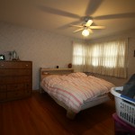
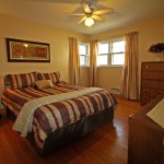
New bed linens, window panels, and a warm paint color to replace the 80’s wallpaper went a long way to update this master bedroom. We moved the tall dresser to the far wall and added a small bedside table to give the room balance. The laundry basket full of clothes found it’s rightful home in the closet. Framed wall art above the bed gives the room a finishing touch.

Master Bedroom Before / After

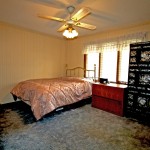
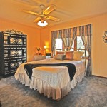
Oversized, mis-matched furniture and an outdated window valance make this master bedroom space feel crowded and awkward. We centered the bed in front of the window to allow space for the massive dresser on the far wall, opening up access to the closet. The large wooden chest was covered with a cloth and moved to the corner to function as a nightstand. New bed linens and updated window treatments help to coordinate the color scheme.

Kitchen Staged To Sell

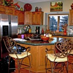
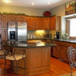
Granite countertops, stainless appliances, tile backsplash and an abundance of cabinets are all key selling features of this kitchen, but they were hard to notice due to too much distracting décor. Reducing the countertop clutter and replacing all but a few of the décor items on top of the cabinets with silk greenery helps the kitchen’s best attributes to stand out. Two barstools were also removed to open up the space around the island and allow foot traffic to flow through.

Family Room

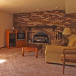
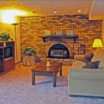
The furniture arrangement in this lower level family room gave the room a lop-sided appearance. Centering the entertainment center on the wall opposite the couch helps balance the room and make it feel less crowded. Gold-framed mirrors and silk greenery draw attention to the fireplace. A floor lamp was added to brighten up a dark corner and existing lighting turned on to provide a cheerful glow.